Categories
Business Finance

The cultural context of annual reports

Culture matters. A lot. Our cultural background shapes the way we view the world, what we find “normal” or “strange”. Cultural biases are very strong in human beings, though they can be overcome by awareness and appreciation of other cultures, through travel and exposure to alternative ways of viewing the world.

Culture even plays a very big role in the financial reporting of companies. And not just in the “technical”/numerical sections, where how we keep the score is influenced by the rules and principles we apply to the calculation (US GAAP used in the US, IFRS used in 120+ countries globally, or “local GAAP”). Each of these accounting frameworks for reporting to the stock market has its own definitions and calculations of metrics such as “profit”. These might be similar in many cases, but are not fully identical.

Culture is much more evident in the “branding” and contextual sections of the annual report, such as the title that is chosen for an annual report, or the messages from the senior leadership in the “letter to the shareholders”.

Both in my years as an employee, as well as in those as a trainer and external consultant, I have mostly worked for global companies with American roots. I like the optimism, forward-looking orientation, and passion to “dream big” that is embedded in American culture. It shines through in the annual report: much of what the CEO is sharing (in the letter to the shareholders) is about the initiatives the company is implementing, the market opportunities it is pursuing, and the great future that is ahead of us. Some time is spent on recent results, but looking back at last year is mostly done in the “Management’s Discussion and Analysis (MD&A)” section, which is much further down the annual report (the smaller font “technical” section that fewer readers get to).

If we then turn to the annual report of a British company, we will find a Chairman’s Review and a Chief Excecutive’s Review (reflecting the two-tier structure in the UK, versus the Chairman-CEO single point of power in the US) that largely deal with last year’s performance, with possibly a little reference to what this means for the future of the company. The tone of these is much more modest, at times even apologetic, versus their more optimistic or even aggressive US counterparts.

The most overly optimistic annual report title (versus the actual financial results) I have ever seen was in the midst of the financial crisis, in the Caterpillar 2009 annual report: the title “How we win” suggests that the company has done very well, while the financial overview shows a 37% drop in revenues versus the prior year, and a whopping 75% (!) drop in profitability versus prior year. Caterpillar is a global company with clear American roots. Worth going beyond the cover page and the impressive marketing/branding efforts on people and products, to get a more holistic view once you go through the key financials (revenue, operating margin, cash flow from operating activities).

It’s worthwhile to review a company’s annual report, as a shareholder, employee, customer, or supplier. But before you dive in, ask yourself what the context is of the (narrative or financial) messages you are looking at!

Categories
Finance Travel

The ATM FX scam abroad…. Traveler beware!

“We will provide GBP notes. Please choose the currency to be charged to your account.” This question (or a variation on the theme) is asked time and again to travelers like myself that withdraw cash from an ATM abroad. So what do you choose? The button on the left in the screenprint below, which leads you to be charged by the foreign bank in the foreign currency of the country you traveled to (and then have your home country bank convert it to your home currency), or the button on the right which will have the foreign bank convert to your home currency directly? Yes, please read that question again, as it takes a significant amount of brain energy to think through, especially if you are tired from travel and jetlag.

Barclays exchange rate
Well, says the average traveler, in the end the ATM withdrawal will have to be charged in my home currency to my bank account anyway, so I might as well have it done right now by this friendly foreign bank, go for the easy road of convenience and get it over with, choose the familiarity of a currency that I know rather than a currency I don’t know so well, so let me press the “Please convert” button on the right. Many foreign banks nudge you strongly towards this option by using words like “guaranteed rate” to instill a sense of safety and comfort.

The startling reality is that having the foreign bank convert the currency for you (the button on the right) is the far more expensive option! And I am trying to figure out which “service” these foreign banks are trying to convince me they should be charging me for. A basic economic premise is that the higher the value you provide, the higher the fee or price you can charge to your customer. However, if you do not provide value to me, then I do not pay you. The foreign bank (in the case of this example Barclays UK) is pretending to sell you “security, comfort, and risk management”, when all they really do is charge you a handling fee for currency conversion which you can easily avoid by having your home country bank (in this case ING NL) do the conversion for you for free at a more favorable rate. At least Barclays discloses their conversion surcharge in a reasonably sized font, so if you bothered to think it through you could figure out what this would cost you. A less respectable Hungarian bank recently made me an offer of 280 HUF to 1 EUR “pre-converted”, while I knew the actual exchange rate was a much more favorable 305 HUF to 1 EUR at my home country bank, so I happily declined. As you cannot assume that the average traveler knows these rates by heart, I am of the opinion that a bank should clearly spell out what the ATM user’s options are, and what they will cost him. Or even better, not even complicate things by offering the “pre-conversion” option, but instead plainly stating that the foreign bank charges the exact amount of foreign currency withdrawn to the home country bank who will then proceed to do the conversion at spot rates.

ING exchange rate

You could argue that withdrawing cash from an ATM is terribly old-fashioned, and you should pay electronically whenever and wherever you can. Unfortunately, the same FX scam applies to electronic transactions as well, in an even more blatant form. I visited Turkey recently, where upon checking out from the supposedly respectable Hilton hotel, I chose to pay by creditcard. The receptionist handed me the terminal in order to input my security code, and without even asking me had preselected the option without my consent to have Garanti bank convert the Turkish Lira amount to US dollars (why would I ever want that when my base currency is Euro?) at a 3% markup. I assume Garanti somehow shares this commission with Hilton, to align the incentives (against the customer). My home country bank then had to convert these US dollars to my home currency of Euro. Direct conversion from Turkish Lira to Euro by my home country bank would have saved me €16. Sure, losing €16 will not bankrupt me, but I’d rather spend it on a cup of tea and some chocolate.

It saddens me that banks try to make money off transactions where no real value is provided to the customer. I had hoped that their ethical standards and commitment to transparency would have improved after all the scandals in the past decade. Yes, it is only a relatively small amount per customer, but this scam does add up with a high transaction volume.

So, next time you’re in front of an ATM abroad, press the “Decline” option when they make you an offer to “pre-convert”.

Categories
Finance

Factually correct, contextually lacking

I often contemplate the nature of reality. Even, or maybe especially, when I review a company’s public proclamations about its financial performance. What is fact and what is fiction? Is somebody trying to put a “spin” on the story? “Objects in the rear view mirror are closer than they appear”….

Fair and accurate representation

When reading earnings releases and annual reports, it is important to realize that companies are required under accounting regulations (and are hopefully intrinsically/ethically driven) to provide financial statements that are a “fair and accurate representation” of the company’s financial position, results of operations and cash flows. These financial statements inherently include “some amounts that are based on management’s best estimates and judgments”. Finance is more an art than a science. Companies that are “listed” (their equity or debt is tradable on stock exchanges), use either US GAAP or IFRS (depending on where they are listed (US or Rest-Of-the-World)) to guide their (subjective) interpretation of the complex operational reality.

So far, so good. Financial statements are put together using judgments and subjectivity. That’s not necessarily the area where I have surreal experiences when trying to inform myself about a company’s success (or lack of it) through studying its earnings releases and annual reports. I get very cautious, as well as excited to uncover the underlying data and “truth”, when I get to those parts of the information where a “spin” is put on the facts: sections such as the “letter to the shareholders”, the 1-page graphical summary showing 5 to 7 key indicators, or the PowerPoint slides provided with the earnings call. Let me discuss several areas where “reader beware” applies. Disclaimer: I am not “accusing” any of these companies of misstatements or of misinforming shareholders, just pointing out that there are cases where information is provided that might be factually correct, but where shareholders that fail to inform themselves about the broader context of these facts might draw the wrong conclusions.

Beware of the time horizon

GE is a great company to study and follow. Always executing multiple big strategic initiatives at the same time, and transforming the business portfolio by making bold moves. The earnings releases and investor outlook meetings are significant events in my calendar. You do however need lots of background knowledge about the company to properly judge some of the statements made.

GE example #1 is the 2Q 2011 earnings release comment on the execution of the capital allocation plan, with a factually true claim of having announced a “third dividend increase, up 50% since 2Q 2010”. Mathematically, this is completely correct: on July 23, 2010 the first increase (from $0.10 to $0.12 per quarter) was announced, then on December 10, 2010, the second one (from $0.12 to $0.14), and on April 21, 2011, the third one (from $0.14 to $0.15). However, this statement omits the 68% dividend cut announced in February 2009, from $0.31 per quarter to $0.10 per quarter. So yes, a multi-step dividend increase from $0.10 to $0.15 does equal a 50% improvement, but it is at the same time still down more than 50% from the “pre-cut” levels. In late 2014, the dividend is at $0.22 per quarter, a further increase versus the lowest point in 2009, but still not back at 2005 to 2009 levels.

GE segment profit 2009-2013

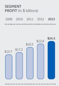
GE example #2 is the segment profit graph from the 2013 annual report. It covers the 2009-2013 timeframe, and shows an impressive increase of $8.8B or 56% from $15.7B (2009) to $24.5B (2013). The graph omits the detailed split between the key segments, which would have shown you that the industrial businesses “only” went up by $1.8B over these years, while most of the increase comes from GE Capital going from marginal profitability in 2009 of $1.4B to much healthier profitability levels in 2013 of $8.3B. A key data point to know for investors, which is not provided in the graph of page 1, but in the summary of operating segments on page 42. Furthermore, the graph uses the common 5-year comparison, whereas a broader 7-year comparison would have told you that segment profit was a stunning $25.6B in 2007. In other words: yes, GE has shown significant profitability improvement in the 2009-2013 timeframe, but its profitability in 2013 is not yet back at pre-crisis 2007 levels.

GE revenues 2009-2013

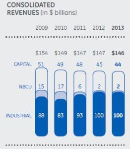
GE example #3 is the 5-year revenue graph from the 2013 annual report. It shows GE’s revenue shrinking from $154B in 2009 to $146B in 2013, and suggests that this is largely due to having NBCU as a fully owned subsidiary in the past (contributing $15B revenue in 2009) to a minority shareholding and subsequent full sale to Comcast (contributing a final $2B in revenue in 2013, i.e. a drop of $13B over the 5-year period), plus the deliberate shrinking of the GE Capital business portfolio (causing a $7B drop in revenue). These statements are factually true, but firstly omit the context of the 7-year overview where GE historically had a much higher 2008 revenue of $180B (!) including NBCU, and $163B excluding NBCU. Secondly, the incremental revenue impact of acquisitions like Converteam, Dresser, Wood Group Well Support, Wellstream, Clarient, Lufkin and Avio is not mentioned or split out. If you split out the revenue impact of a significant divestment like NBCU, shouldn’t you split out the positive revenue impact of the acquisitions in the same graph?

Beware of “non-GAAP” supplemental information

Companies in the healthcare sector tend to be highly profitable in most years (EBIT margins in the 15-20% range), but have very volatile earnings. Many of these companies provide “non-GAAP” supplemental information, stating that the alternate figure more accurately reflects their company’s performance. In most cases, this means isolating “unusuals” or “special items” from the performance: common examples are litigation charges and settlements, product recalls, restructuring costs, acquisition-related charges. The non-GAAP (“after clean-up”) profit in almost all cases is higher than the GAAP profit (what the official accounting rules tell you to report).

Baxter adj EPS 2009-2013

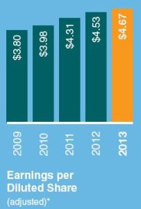
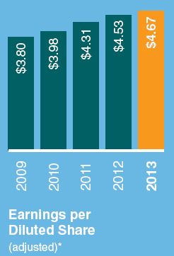
Baxter provides a graph every year of “Earnings per Diluted Share (adjusted)*”, a nice smooth graph of steadily increasing EPS. Earnings per Share is a fairly straightforward metric: total net income divided by the number of outstanding shares. Repurchasing of shares by a company can have a huge effect, as it decreases the denominator in the equation. In Baxter’s case, the adjustment of the numerator (earnings, or net income) has a much bigger effect. In 2010, the net income was $1.4B, while the non-GAAP profit (excluding special charges) was $2.4B, a difference of $1B. Strangely enough, this huge difference is not explained in any detail in the annual report, but there is some small print explaining the “*” mark: “Please see the company’s website at www.baxter.com for a reconciliation to earnings per diluted share.” My personal opinion in this is that companies should make these adjustments (on a line item basis) an integral and upfront part of their financial reporting.

A review of other companies (J&J, Abbott, Hospira, BD) in the healthcare sector showed that the significant size and number of non-GAAP items is common practice in this industry’s financial reporting. Hospira even turned a 2013 GAAP loss of $8MM into a $348MM non-GAAP profit by adjusting for 9 different special items.

Beware of euphemisms

The letter to the shareholders is a useful document to read, it informs you of the company’s strategy, accomplishments, and performance. Be careful with the wording, as euphemisms are sometimes used that should trigger a desire in the reader to dig more deeply into the actual financial performance. Just like the phrase “Mr X is pursuing opportunities outside the company” is often a nice way to say Mr X was fired, companies can use sentences like “….. created significant headwinds for the company. Despite these challenges, the company also enjoyed many accomplishments” to talk “around” the problem. This is the time to pause and dig into exactly what the size and impact was of those headwinds, and whether these headwinds were one-off or will continue to have an impact in the future, before turning to the accomplishments that are likely to be of a significantly smaller size.


“Objects in the rear view mirror are closer than they appear”

Annual reports and quarterly earnings releases should not just be legalistic documents that are mechanically filled in, with templates copied from the previous period where only the numbers updated. Any company should provide an accurate and full representation of the strategic, financial and business risk situation, both in letter as well as in spirit. Drawing selective attention to some items rather than others is not quite the same as lying, but I would not call it fully transparent either.

Categories
Finance

What we can learn and predict from GE sharing service margin data

The following table on page 4 of GE’s Q3 earnings release webcast presentation got me very excited as a financial analyst.

GE industrial margins

There’s a lot we can learn and predict about GE’s Industrial margins from this little table. I love puzzles, including “backing up” into a company’s numbers. Here we go….

How much margin does GE make on services and equipment?

If 3Q’14 YTD Operating Margin was 15.1% (of revenue) in total, with services at 30.6%, then we need the split between service and equipment revenue to calculate the equipment margin. The 2013 annual report tells us that the split of industrial revenue is about 28% services and 72% equipment. If we assume a similar revenue split for 3Q’14 YTD, then we can use the weighted average method to back into the equipment margin.

We have an equation with one unknown: Equipment margin * equipment as % of total revenue + Service margin * service as % of total revenue = Total margin. Equipment margin * 72% + 30.6% * 28% = 15.1%. Therefore equipment margin is (only) around 9.1%.

It would get even more interesting if we had service and equipment margins, and the service/equipment revenue split, by business, but understandably GE does not provide this level of detail (you don’t want to give away that level of confidential information to your competitors).

Where will GE’s Industrial OM% be for total year 2014?

GE achieved 15.1% Operating Margins in the Industrial business 3Q’14 YTD, which is up 50 basis points (bps) versus last year’s number must have been 14.6% 3Q’13 YTD. Total year margins in 2013 were 15.7%, i.e. 110 basis points (1.1%-pt) higher than the 3Q’13 YTD number. Q4 is a very high margin quarter for GE, last year @ 18.3%. Last year, around 29% of total year Industrial revenue came in Q4, it therefore also has a disproportionate impact on the total year margin (volume leverage: variable costs go up with revenue, base costs stay fairly flat). If total year margins in 2014 are (like last year) 110 bps higher than 3Q YTD, and/or total year is up 50 bps (like 3Q’14 YTD was), then GE should be able to reach at least 16.2% Industrial OM% for the total year (a nice progression versus 14.8% in 2011, 15.1% in 2012, 15.7% in 2013).

However, the “SG&A (Selling, General and Administrative Expenses) reduction” chart leads me to be more optimistic.

GE SG&A

For total year, this estimate (published on October 17, with the Q3 earnings release) says that SG&A will be reduced by around 1.9%-pts for the year (excluding restructuring), gaining even more traction than the Q3 YTD cost-out performance. Furthermore, GE continues to expect a positive value gap (selling price versus purchase price developments) for total year, which helps margins. I am not quite sure of the effect on average margins of the strong Power & Water volume expected in Q4: as a business Power & Water is above average in margins, however equipment is at lower margins than services.

All in all, 80 bps to 100 bps, in other words a total year Industrial OM% of 16.5% to 16.7% might be possible, in my (subjective) opinion. If that turns out to be the case, it might a large positive surprise for investors, and a sign that GE does deliver on key commitments!